Showing posts with label BigIdea. Show all posts

4/1/12

Pretty Palette challenge

I missed last week's Pretty Palette challenge and I am happy to be back in the groove! And this week our color palette is so pretty and springy~


I love pastels and I needed a card for Easter so this was the perfect selection! While it's April 1 and RELEASE DAY at My Time Made Easy, I turned to another set for my card -


I used the Just for You set which is one of my favorites because it just has a little of everything for just about any occasion!

Here's some Big Ideas for you this week from this card.

* The three color strips were all embossed together so when they were lined up and adhered to the card front, the embossed pattern would flow from one to another.

* The wheelbarrow was stamped in black and this created black grass in the image. To change that, I took a scrap of green cardstock and hand cut a few "spikes" of grass and then adhered over the stamped grass in the image, giving me green to match the vertical strip.

This card will hold a gift card for some special people (can't say who right now) on Easter so the sentiment "A little something" was just right - kind of describes the little wheelbarrow image too!

That's it for me today  - I hope you'll stop by and see what the rest of the team created with these colors and then join in the fun! You can use any products but you will definitely want to check out what's new at MTME - sooooo pretty!! See you again soon!


Photobucket

3/11/12

Orange, White and Green

Orange, White and Green - those are the colors for our next Pretty Palette color challenge. Hmmm. This one had me stumped for awhile. Then I received some goodies in the mail and voila! Tucked in the package was a cool orange library-type card. And some of the paper I just purchased was green and white. An idea was born!


So I gathered up all these new goodies and even salvaged a kraft circle sticker from the packaging that my purchase my came in and got to creating! The stamp sets I used are Just for You and Petal Perfection. The orange card was a little slick on the surface so my ink didn't "take" as well as I hoped so the words are a little light but easier to see in person.

Big Ideas for the week include:

* Look around and find items that can be recycled into your artwork. Create a great card while doing a part to save the planet :)

* Try tying a bow underneath a button before adhering to your project. This bow was made from baker's twine.

* Don't forget to distress card edges with ink to shabby things up a bit.

Come join in the fun this week at the My Time Made Easy blog - we'd love to see what you create with our Pretty Palette!
And be sure to check us out next week when we celebrate our 1st Anniversary of Pretty Palette challenges!! There will be a prize give-away so don't miss out!
Photobucket

3/4/12

Pretty Palette 50

Today starts the Pretty Palette challenge 50 at My Time Made Easy - won't you join us?

Here is the color palette we're working with:


And my card:

The colors were inspired by the Under the Cabana digi-paper pack. I didn't use the papers this time - I stuck with cardstock colors that were close to the colors. Have you been following this blog since the time when I used to add in a BigIdea (or 2) once a week with my post? Well, I am going to try to get back to that, starting with this post.

BigIdeas are just things that I've incorporated into my card that you might want to try yourself. For example, the BigIdeas this week include:

* Stamp a pattern on your focal piece mat for interest without using pattern paper. I used the Argyle Amazement set with Versamark ink to create the pattern on the peachy/tangerine layer.

* The bee from Bee-Loved was stamped twice - once directly onto the flower and once on the daffodil cardstock. I could them cut out the bee and not worry about the tiny antennae because when I added the image over the one stamped on the flower, those parts were right where they were supposed to be! The flower and sentiment is also from the Bee-Loved set.

* The sentiment banner has a slight curve to it so it doesn't lay flat on the card front. This gives a little movement to the card and goes along perfectly with a bee in flight.

* And finally, this card is smaller than usual - 4 1/2 x 3 1/2. By keeping the card a little smaller, I can overhang some of the elements and it will still fit in a normal invitation sized envelope.

Thanks for stopping by and I hope you join us this week at MTME!
Photobucket

11/8/10

Get into Shape - with a shaped card!

This week's challenge at Heart 2 Heart Challenges is to create a card that is not square or rectangular in shape. Wait till you see all the great ideas the Design Team came up with! Here is my card and a few Big Ideas to share with you:


* To get some additional use from your Nestabilities, use the largest ones to create a shaped card. By starting with a folded piece of cream cardstock, and off-setting the top edge of the Nestabilities die so the folded edge doesn't get cut, I created this great oval shaped card with top fold.

* Repeat the same Nestie shape for your image and mat for a cohesive look.

* To bling up a mat for your card, use the embossed edge of the cut piece as a guideline and add some glue with a fine tip glue pen and then sprinkle with Prisma glitter. Click on the card to get a closer look at the sparkly edge of the blue mat.

* Remember, not all cards need to have a full colored image as the focal point! A sentiment works great too! And if you're not afraid to try, cut your acrylic sentiment stamp so you can fit it where you want it. This particular sentiment was cut apart so I could make one line of the saying (come and go with seasons) into two lines.

Now it's your turn! We would love to see what shaped creation you can come up with! Head over to the H2H challenge blog for all the details and happy creating!

Photobucket

10/17/10

Last Day for Candy Give-away and Corrosive Challenge

Today is the last day to enter my blog candy give-away - see this post for all the details!

This week at Corrosive Challenges, we are challenging you to create a card that doesn't include the color white. No white allowed!  I thought this would be a real challenge since I was working with a digital image from our sponsor, Robyn's Fetish, but it turned out to be not so difficult - take a look:


Here are some Big Ideas from this week's card:

* Print digital images on light colored cardstock for a different look. I chose a light peachy color to print on and then added color to the jack-o-lantern with my Copics. Hard to see in the photo, but his eyes, nose and mouth were colored with a sparkly black pen.
* Use both sides of your DP for instant match-ability! I also used a larger Nestability die to cut the piece of DP at the left side of the card, keeping the "fancy" edge of the cut toward the center of the card and then trimming the outer edge even with the card base.
* Working with a black mat but don't want the interior of your card to be black? Mount the entire piece to a card base of a lighter color - in this case, I used the same peach cardstock that I printed the image on.

We'd love to see what you create with no white. Play along at Corrosive Challenges this week and you might win this month's prize package and a chance to be a guest DT member~
See you again tomorrow!

Photobucket

9/26/10

Masking at Corrosive

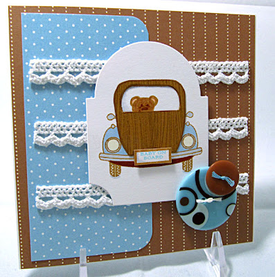
This week at Corrosive Challenges, we are challenging you to try your hand at masking. For those who have never done masking, it's pretty easy. Let me show you my card and explain the steps:


Big Ideas - Masking:

* Start with the image you want in the foreground. In this case, the car is the prominent image and the teddy is tucked inside, making it a layer behind the car. Stamp the foreground image.
* Now stamp the foreground image again on a thin piece of paper, like printer paper. I like to use a sticky note so there is a little easily removable adhesive on the paper. Cut the image out and lay it over the image you stamped in the previous step. This is your mask. In this case, I stamped the car onto a post it note and cut it out, also cutting away the inside of the window to create a space for the bear.
* Now use your second image and stamp where you see fit. The mask will hide a portion of the image, which is what you want! In this case, the mask hid the lower half of the teddy so you can just see his face in the window.
* Remove the mask and you're ready to move on!

For this card, I did stamp the car a second time on a sheet of cardstock that was stamped with a woodgrain background stamp and then cut a section out and paper pieced it to the car. This step, had I thought of it right from the beginning, could have saved myself the masking step but it was an after thought so I masked and stamped first.

Car image and papers from Papertrey Ink. Teddy bear image from Taylored Expressions. Buttons from Wal-Mart.

I hope you enjoyed today's masking info and are going to give it a try this week for the Corrosive Challenge. If you need more information, Google "masking" and I know you will find a wealth of great tutorials.

Have a creative week!

Photobucket

9/12/10

Smile - it's a sketch!

Time for a sketch week at Corrosive! We're playing for a new set of prizes this month - stop by and play along! Here's the sketch:


And here is my card:


This stamp is from My Favorite Things and I picked her up at CHA - just couldn't resist! Paper is from Cosmo Cricket - DeLovely. Here are just a couple of Big Ideas for this week:

* Allow yourself to take some liberties with a sketch but keep the overall look so the sketch can be "seen". In this case, the oval changed to a different shape and the image section was positioned higher on the card than the sketch shows. I also added a section with a sentiment at the bottom but even with the changes, you can still see how this card was based on this sketch.
* I've probably mentioned this before but it doesn't hurt to say again - allow elements on your card to overhang an edge for an interesting element. In this case my ribbon (2 pieces together creates the 2 colors) overhang and add to the whimsy of the card. Just remember you need a larger envelope to fit the elements!

Now it's your turn to get creative with the sketch! Be sure to link up at the Corrosive Challenge blog so we can see your artwork. You might just be this month's prize winner!

Photobucket

9/5/10

Corrosive Color Challenge

Red and green always make me think of Christmas but since I am not ready yet to get the Christmas cards started, I thought I would go a different route for the Corrosive Challenge this week to use Old Olive and Real Red. And with a great choice of digital images from our prize sponsor this month, Inktegrity, I found just the ticket!


This awesome tree with tire swing was the perfect fit for some paper piecing - a real love of mine. And super easy with digital images since you only need to print as many pieces as you want to work with and then get to piecing! Here are some Big Ideas included in this card:

* Pop some of your sections up on foam tape when paper piecing for added dimension. The lighter green sections of the tree are added to the card this way.
* Add some additional color to pieces with markers or pencils for more detail and highlights.
* Replace small elements with embellishments. This image included a tire swing which I depicted with a button. It doesn't look exactly like a tire swing but there's no mistaking that it's there to represent one.

The colors are not a literal display of Old Olive and Real Red but the papers I used are definitely in those colors (from Cosmo Cricket and an unknown source for the green sections). I also took a little liberty adding the leafy background which has a few additional colors but that's what creativity is all about - going with the flow!

I hope you'll join in the fun and show us your Old Olive/Real Red cards at the Corrosive Challenge blog this week. Great prizes up for grabs!

I am off to get some things done around here today before we head out for a cookout with friends this evening. Hope you are all enjoying your Labor Day weekend!

Photobucket

8/22/10

Drinks are on us!

Our theme this week at Corrosive Challenges is drinks. One of my favorite drinks is tea so when I had a chance to purchase the Tea for Two additions set from PaperTrey Ink, I knew it would be a set I would put to use often!


All product used is from PaperTrey. Here are some Big Ideas for this week's card:

* The flower was die cut from felt and layered before adding the ribbon center. To create the center piece, I hand stitched a loose thread line along one long side of the strip of ribbon and then pulled the ribbon so it ruffled and formed a circle. Then I stitched the ends together and stitched it to the felt flower, adding a button to the top. I also added some french knots to the outer edge of the petals for a little extra texture.

* The spoon and teabag tag were stamped onto the cardstock after I cut out my teacup and lightly added some pencil marks so I would know where it would be placed. This way, the items in the background appear to be in the cup and the it was easy to cover the "ends" by foam mounting the cup to the piece.

* Mix and match sets to get the look you want. In this case, the sentiment came from the On the Couch (additions?) set and it worked perfectly for my card. You can also mix and match mats for an interesting and different look.

* A little inking and distressing of the edges of your card/mat adds another subtle element of texture and dimension so don't forget to grab an inkpad and distress away!

* Finally, to add something to DP, stamp a little. If you click the photo for a larger view, you will see that I random stamped a small flower image from Beautiful Blooms across the polka dot paper to add a little more visual interest and to tie into the flowers on the teacup.

I hope you enjoyed today's card and ideas. There is a lot more drink themed cards to see at the Corrosive blog and I hope you will join in the fun and play along! See you again soon -


Photobucket

8/8/10

Sketch week at Corrosive

This week we are working with a sketch at Corrosive Challenges - one of my favorite things to do! Here's the sketch and my sample:


The image I used is from Paper Makeup Stamps, our sponsor for this month's challenges. I don't know why but when I saw this image I thought of the 70's so my colors are inspired by that - bright and maybe a little "flower child". Although that might be more the 60's but at any rate....  Here's a Big Idea for this card - and it's a Photoshop tip:

* I was having trouble coloring this image - for some reason, the ink from my printer was smearing a bit which almost never happens. So I decided to color the digi image right in Photoshop and then print it completely colored. I chose the colors I wanted for the hair sections and used the paintbucket to "fill" each section. Then to give the hair some texture, I chose a pattern (this option will be available with the paintbucket) and set the opacity very low - to 13% - and then filled each section again. I think the pattern I used on this particular card is Wax Crayon. By setting the opacity really low, you are not adding much color (patterns are mostly greyscale) but you will see a texture appear on your image. Click the picture to see a larger version where you can see the texture better.

That's it for me today. I hope you will join us at Corrosive Challenges this week and try your hand at our sketch - and maybe at a little Photoshopping too! Have a wonderful Sunday!


Photobucket

8/1/10

Corrosive - Baby Style

This week over at the Corrosive Challenge blog we are creating things for baby - cards, layouts, gifts - anything you can think of that makes you think of a sweet smelling baby. Don't they always smell so good? Ok well maybe not always but you know what I mean!

And as today is the 1st of August - I have two announcements - first, HAPPY BIRTHDAY to my wonderful son, Jacob!! And 2nd, today starts the 1st day of my term as guest Design Team member at Shirley's 2 Girls! I am so excited to be working with them and wait till you see the goodies I have to share with you through the month! Watch for my first official post this coming Thursday!

To kick off my time with S2G, I am using one of their digi images for today's baby card - take a look:


The papers are from Chloe's Closet and Papertrey Ink. The image was colored with Copics (of course) and here's a couple of Big Ideas to share with you -

* To create a different element on your card, try adding pleated paper. Now on this one I didn't quite pleat but instead accordion folded the paper and adhered it to the card front just at the left and right ends. The folds create quite a bit of dimension so the image is adhered to the card front with a few pieces of foam tape stacked on top one another. It is also adhered to the card front only at the top of the image, not at the bottom, so as not to squish the folds.

* Cut a small slit in the spine or fold of the card and slide ribbon through and tie in front over the folds for a finished and decorative look.

I hope you will join us this week and create something sweet for baby. Then leave a link at the Corrosive blog so we can see what you created. You might just win the prize package for August!

I will be back tomorrow with another new challenge from Heart 2 Heart Challenges and artwork from the new DT members - it's gonna be fun! Until then, have a creative day!


Photobucket

7/25/10

It's Pink and Blue at Corrosive

This week at the Corrosive challenge blog we are working with pink and blue. Now I know, right away you're thinking baby but hold on to that idea - it might come in handy in another week or so (hint, hint).

We want to see what you create using pink and blue as the primary colors in your artwork. Here's my sample:


What's not to love about Izzie with her adorable curly hair and sparkly cake? And she is wishing someone special a very happy "birfday"....hehehe. The image is from Stamping Bella and the papers are from Cosmo Cricket (DeLovely).

Here's a couple of Big Ideas for this week:

* Have you tried a pleated ribbon embellishment yet? It's easy to do with a little adhesive tape like Scor-tape. Just cut a small piece and place on ribbon. Make a fold in the ribbon on to the top of the tape. Adhere. Add a second piece of tape and repeat until you have a length of pleated ribbon for your artwork. No stitching required!
* Border punches aren't just for borders. Use a border punch at the ends of a sentiment piece to add a little whimsical detail (see the Apron Lace border punch used on the sentiment above).

That's it for me this morning but I will be back later tonight for the monthly PTI Blog Hop!! If you have some stamping time, we would love to see your pink and blue creations at Corrosive!

Have a creative day!

Photobucket

7/11/10

3, 3, 3 challenges in one

This week at Corrosive Challenges by Janet, we are working with this sketch:


Here's my card -


I am also entering this at two other challenge spots - PaperTrey PaperDolls - their challenge is to create a non-standard sized card and this card is 6 1/2 x 5 1/2 and it will also be entered at PaperTrey Posse where they are looking for information on how I first learned about PaperTrey Ink and what the 1st stamp set I owned was. So here's my story for that:

I am not entirely sure how I was introduced to PTI but it may have been through Splitcoaststampers about 2 years ago. I do know that my first PTI stamp set was Butterfly Kisses, which I no longer own. So I pulled out the "oldest" set of PTI stamps I have (Guidelines) and used it on this card along with the newest set of PTI stamps I own (Friendship Jar Fillers).

The background paper is also from PTI and I hand wrote the names of some of the other sets of PTI stamps I am now the proud owner of. And yes, my collection has certainly grown over the last 2 years! How can anyone resist with such adorable images and fabulous artwork from the design team, like the posts of the soon-to-be-released products that Nicole is showing on her blog?? Be still my heart! If I only had half her talent!

Here's a couple of Big Ideas for you to consider from this week's card:

* Incorporate your own handwriting for a personal, "handmade" feel on cards as well as scrapbook layouts.
* Don't be afraid to cut off part of an image to fit your space - the paintbrushes are actaully longer than this (and meant to sit in a jar) but I needed a shorter image so I cropped them off at the bottom to fit.

Ok so that's it for me today - I hope you will play along with the sketch this week and check out what the rest of the team created at the Corrosive blog. See you again soon!
Photobucket

7/4/10

Christmas in July

Happy 4th of July - the day we celebrate Christmas?? Well, we are in fact celebrating Christmas at the Corrosive Challenge blog this week and we hope you will join us!

This holiday quintet is starting early with some caroling and they seem to be enjoying every moment - even if they are actually out of season!  Here are this week's Big Ideas:

* Maximize DP that is printed on two sides by using each side in your card. You're always guaranteed a look that "goes together". I thought this paper by Basic Grey was the perfect compliment to the choir - a little house in the background for them to sing to and the blue swirly print at the bottom to represent snow.

* No need to add a mat to your image - ink the edges so your focal piece pops off the backgound! I didn't want to add a mat here because doing so would have resulted in a loss of more of the DP as well as the punched edge along the top edge of the blue patterned piece. This stamp is from Stamping Bella, by the way.

Now it's your turn! Create a Christmas card this week and link it up over at the Corrosive blog. There are goodies to be won so hop over and see what's going on at Corrosive and be sure to check out the rest of the DT's holiday creations!

Have a wonderful holiday weekend!

Photobucket

6/13/10

Corrosive sketch

This week at Corrosive Challenges we are working with this sketch:


Ahhhm I love a good clean sketch! So I created a pretty clean and simple card:


Following the sketch, I kept the layout simple and clean for this executive Bella. The paper is so bold that to add embellishments would have just been a little too much. Here's some Big Ideas for the week:

* An image doesn't have to be 100% paper pieced if you like to paper piece. In this card, the carpet  and the blue floor vase are both pieced, adding a little interest and a slight bit of dimension to the image.
* In the absence of embellishments, I have the entire focal piece added to the card front with foam tape giving the card some dimension without adding extra bulk or bling.

Want to play along with us? Head on over to the Corrosive Challenges blog and see what the rest of the team created and then let's see what you can do with this sketch!

I am off to finish cleaning house, grilling out today and maybe getting in some stamping time - yeah!
Photobucket

6/6/10

Die-cuts with Corrosive

I'm going to keep this short and sweet cause the weather is not good right now while I am trying to get this post ready for Sunday's Corrosive Challenge and I might have to take cover. Yikes!

This week the challenge at Corrosive is to add a die-cut of some type to your artwork. Here's my sample:


Now you can use a Cricut die cut, or a Nestabilities die cut...the choice is yours. For my card, I used a die cut dimensional sticker from Basic Grey that matches their beautiful Capella papers. How about a couple of Big Ideas to go along with this week's card?

* The lacey trim that is horizontal across the card is a vintage piece of trim that my mom had in her sewing stash. I can't even tell you how long she has had this but it may very well be close to 20+ years! It has a varigated ribbon that runs through it that ranges from a peachy-pink color to cream to pale blue, and to age it a little more, I inked the edges with a light tan ink.
* The bow was created from a piece of white satin ribbon that I colored with 2 pale Copic markers to match. Just drag along the edge of the ribbon a couple of times to add color.
* To scrunch the ribbon, I added a strip of double stick tape to the back side of the tails and the pinch here and there to crinkle and then stick to the card front so these tails stay in one place.

Ok that is all for me - the tornado sirens just went off. I am going to schedule this to post tomorrow morning and I am sure by then, all will be much calmer. Be sure you pop over to the Corrosive Challenge blog and see what else the team created and then join in the fun! Until next time -

Photobucket

5/31/10

H2H Sketch

DON'T miss out on my give-away - scroll down to the post below this one for more information!!

Welcome to another week of challenges from Heart 2 Heart and Happy Memorial Day!

This week we are getting sketchy - here's the sketch we are working with:


And here is my card based on the sketch:


Disclaimer: Yes, I used paper and stamps that are not currently available from CTMH. But I couldn't help myself!!! I just received the Felicity kit that was a promotion back in January maybe and I just had to use it. If you are looking for this set, I bet there are some hanging around out there to be had. Let me know - I'll hunt one down for you.

So on to my card. Of course, all products are from Close To My Heart except the three pearls that were added as embellishment. Since I forgot to add any Big Ideas to my post yesterday, how about a couple today?
* The bird was inked up first with Blush ink and then the edges were rolled in Sorbet ink for a two-tone look.
* The "branch" swirl was stamped with 2nd generation stamping using Desert Sand ink. 2nd generation stamping is done by inking up your image, stamping once on scrap paper and then the 2nd time on your project for a lighter look.
* Don't forget to flip that B&T paper over for a complimentary but more subtle printed paper.

So how about joining in the fun this week at H2H? We'd love to have you play along! All the details and a whole lot of inspiration can be found at the challenge blog so be sure to check it out. And have a wonderful holiday! Until next time -
Photobucket

5/9/10

The Little Things

Happy Mother's Day!

This week at Corrosive Challenges, we are working with the following sketch:


And being that we are posting on Mother's Day, I decided to go for one more card that would be perfect for Mom:


And isn't that what Mother's Day is all about - enjoying the little things. This Mother's Day I will be enjoying:
1. My family, although that is not at all a little thing.
2. The fact that I can spend the day not helping with any homework (this semester is over - yeah!)
3. A wonderful dinner that will be prepared by the men in the family. Hopefully they take care of the dishes too!
4. A new episode of Desperate Housewives and Brothers and Sisters - the season will be over all too soon.
5. Some time to stamp - always a time of enjoyment for me!
6. A day without rain, even if it is a bit chilly.
7. And who knows what other little blessings the day will unfold but I plan on enjoying them all!

A little run-down on my card - papers are from the Quite Contrary line from My Mind's Eye, stamps are from CTMH (flowers) and All That Scraps (sentiment). Here's a few Big Ideas to try:

* Use a piece of ribbon to create "leaves" for your stamped flowers.
* Slightly roll the outer edges of your cut out flowers to create easy dimension.
* Let your sentiment take center stage. I know I have said that before but I forget it myself and when I finally do give it a go, I love the results!

That's all for me today but I have a lot of posts coming your way this week - gonna be a creative one! Meanwhile, I hope you'll join in this week's Corrosive Challenge using our fabulous sketch! Just created, post and link on the blog. You might win a great prize package!

Until next time, have a wonderful day and enjoy the little things!

Photobucket

5/2/10

Happy Birthday

** The newsletter can be found in the post below this one~

Today's Corrosive Challenges is all about Birthdays as Janet is celebrating hers- Happy B-day Janet! So we all created something birthdayish and hope you will join in and play along with us. Here's my card:


Doesn't that image just make you laugh out loud? I couldn't resist this cutie when I placed an order recently at Stamping Bella. I paired her with some Basic Grey paper and picked up the pink from the paper for her dress and the fun ribbon trim. Her hair had to be "red" as she reminds me of my daughter with her love of balloons.

Here's a few Big Ideas for this card:

* You can alter the look of your image by cutting off a section of your Nestie-cut image. In this case, I cut away the bottom scalloped edge so my image would fit the card better but you can do that even when fit is not an issue. Sometimes it just creates a different look that works for your project.
* Think in threes to add balance. Now, I am no art major and I'm not even sure I also get the concepts spot-on but I have learned over time that working in elements in an odd number, add more balance to your artwork. Since my image had 2 balloons, I punched my sentiment to add a third circle to the completed card.

Want to play along with us this week at Corrosive Challenges? Just create something that is about Birthdays and link it up at the challenge blog. It's a new month so there are new prizes waiting to be won!

See you tomorrow for another H2H Challenge~~

Photobucket

4/25/10

Corrosive with Charm

This week's challenge at Corrosive Challenges by Janet is to add a charm (or 2) to your artwork. Let me also say that I am pretty sure I got the challenge right, unlike last week when I created a card with paper piecing and it was supposed to be a card with paper PIERCING.....2 different things.

So my card this week features both:


Oh I love how this turned out! Sometimes things just come together. So far, no sentiment - I haven't decided if it will be a Mother's Day card or a Birthday card. I like leaving sentiments off the cards often for this reason - so I can use it at a later date for a variety of reasons.

Anywho, here's some Big Ideas from this card for you to try:

* Keep your card simple and understated by using just a couple of colors (plus white or cream) and then add in one element that POPS with color!

* Create an easy bow by taking a length of ribbon, making 2 loops and then tie all together in the middle with a piece of twine threaded through a button. This way you don't actually tie the ribbon and the loops on the ribbon stay right where you want them. Add the finished bow to the card front with a glue dot.

I would like to try to create a video tutorial on bow tying strategies - if I get that done, I will include this method as well since I think a visual would be better than my description.

We would love it if you would play along with us over at Corrosive. Just add a charm to your card and then link up over at the challenge blog for a chance to win this month's prize package~
Until next time, have a creative day!

Supplies:
Chair stamp-Impression Obsession; flowers-unknown

Ink-Close To My Heart
DP-Close To My Heart
Cardstock-PTI
Charm and ribbon-unknown
Border punch-Martha Stewart

Photobucket